
New graphics and data visualizations are emerging every day trying to portray the data and reality that surrounds us. However, like most things in the world, it is the law of Occam's razor that sets the bar. It is a principle of theory construction or evaluation according to which, other things equal, explanations that posit fewer entities, or fewer kinds of entities, are to be preferred to explanations that posit more. Or in other words, the simplest solution is usually the best. This is especially true with graphics and data visualizations. One can spend endless hours designing a new dashboard that no one is looking at later, simply because it is either too complicated or it is not answering the questions users want to pursue.
Whether that is in education or not, at the Learning Analytics Collaborative (LAC), we strive to present the information in the simplest way to enable teachers and schools to take data-informed actions to ultimately benefit the learners. The LAC is a partnership between educators, data scientists, and visionary leaders from schools around the world seeking to harness the power of learning analytics to better understand learners and their learning context in our efforts to improve and transform schools. Visualizing student data to support learning has been our driving goal and we have been promoting best practices when it comes to data visualizations and creating cultures of data use at schools since 2015, now with over 40 member schools across all continents we have developed over 35+ different data visualizations.
To achieve such an ample result we need of course, apart from great visualization that lets you intuitively interrogate your data, a data culture across the whole school that allows teachers and administrators to use information they are collecting. However, let's leave data culture for another time and focus on the data itself.
For that we need to go back to basics and start with Why? Why are you looking to visualize a certain dataset? What questions are you hoping to answer? Who will use this visualization, why, and when? Answering these basic questions will give us a good starting point and will also stop us from visualizing something that doesn’t need to be visualized in the first place and will guide us towards the best possible solution. Schools by nature collect vast amounts of data daily, whether that is from students, parents, teachers, or community members. We need to use this abundance of information and turn it into insights.
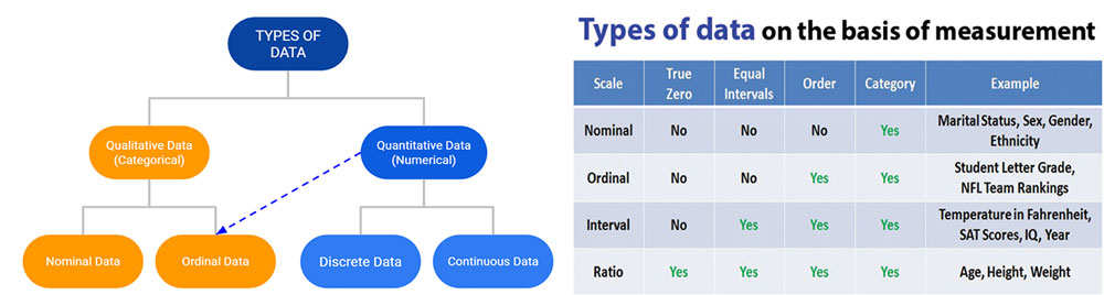
Before we are able to use data and turn it into insight through Data Analytics, we need to understand what data is and how we categorize it. We also need to know the data type you are dealing with in order to either choose the right visualization method or be able to understand and consume the information being presented.
We instinctively know that data can be either qualitative or quantitative, but only once you start to dive into further subcategories can this help you in choosing the best graphic. All of the below types exist and are being collected in education; hence getting yourself familiar with them as well as the scale of measurement that is used for these will give you a head start.
In the school context, educational data often include:
Then there is the question of data quality, in line with the oldest mantra of the data world “Garbage in - Garbage out.” For data to be useful they should be collected and collated systematically and for a clearly identified purpose. The right data collection method can mean the difference between useful insights and time-wasting misdirection. We also have to remember that Qualitative and Quantitative methods of data collection are complementary and need to work hand in hand for best results. It is best to collect and use high quality data to underpin educational decision making and practice. Especially, that most often we will find ourselves in a position of using a secondary data source, one collected by someone earlier, possibly for a different purpose then we are trying to utilize it for. This introduces new investigative questions or measurement in addition to/other than the ones originally used when the data was initially gathered. So, before you dive into any adventure with creating graphics, make sure the data you are using is:
That’s the preamble. Once we have satisfied all of the above requirements, we can dive into visualizing the raw, cumbersome, and dry datasets, and bring them to life, create insights, change mindsets, and drive data-informed change that will benefit teachers and their students.
---------------------------------------------------------------------------------Piotr Olczak has been working in Planning, Analytics and Business Intelligence for over 15 years in both higher education and K-12 Schools. Prior to joining Consilience Education Foundation as Director of Learning Analytics, Piotr had been working for over four years at an international school in Saudi Arabia as their Data Analytics & Technology Lead. He has a master’s degree in Econometrics with a specialization in Operational Research and Optimization.
Piotr has extensive knowledge of deploying Information and Analytics services, designing and implementing BI Dashboards and engines, and leveraging visualization tools. He is committed to developing cutting edge data analytics services for Education utilizing business intelligence solutions while applying wide knowledge of operations & strategic analysis methods and practice. Piotr sees data and information as powerful enablers that can bring strategic insight and improve practices and processes. He focuses on championing a culture of evidence-based decision making to improve learners’ outcomes. Piotr is an experienced leader, mentor, and manager, always seeking to engage stakeholders at all levels.


